Driving Customer Lifetime Value via "Buy It Again"
Project Summary
At Gap Inc., users faced significant "browse friction" on the mobile app. To see color variations, users were forced to navigate back and forth between the Product Listing Page (PLP) and Product Detail Pages (PDP). This project aimed to streamline discovery by integrating color indicators directly into the PLP grid.
The Result: Through iterative design and A/B testing, we discovered that minimalist visual cues outperformed complex interactive components, leading to a significant lift in Add-to-Bag (ATB) rates and overall conversion.
Role: Lead UX Designer | Impact: Increased Repeat Purchase Conversion


Strategic Goals
Reduce friction
- Surface past purchases without requiring users to dig.
Prevent errors
Account for apparel-specific variables like size and color before adding to bag.
Scale across brands
One system that works for Gap, Old Navy, Banana Republic, and Athleta.
Design Process & Key Decisions
Starting Point: A Modified PLP
Early in the project, with timelines tight and data requests still pending, the team floated the simplest possible solution: a modified version of the existing Product Listing Page, filters and all. It was the fastest path to ship.
I pushed back on locking in that direction before we had real data to work with. Once I got in touch with our data analyst and the dev team, the picture shifted considerably.
What the Data Actually Said
Our data infrastructure spans inventory systems, engagement metrics, order history, and customer behavior platforms. Getting a clear answer required active collaboration across those sources. Two findings changed the design direction:
- Most repeat purchases happen within 30 days of the original order.
- Users average around 7 eligible items in their list at any given time, since items only appear if the product page is still live.
A feature built around 7 items doesn't need search, sort, or filter controls. It needs to not feel empty or pointless. That realization moved the focus from "how do we organize a long list" to "how do we make a short list feel worthwhile."
Designing for Apparel: One Intentional Confirmation Step
Efficiency vs. Redundancy
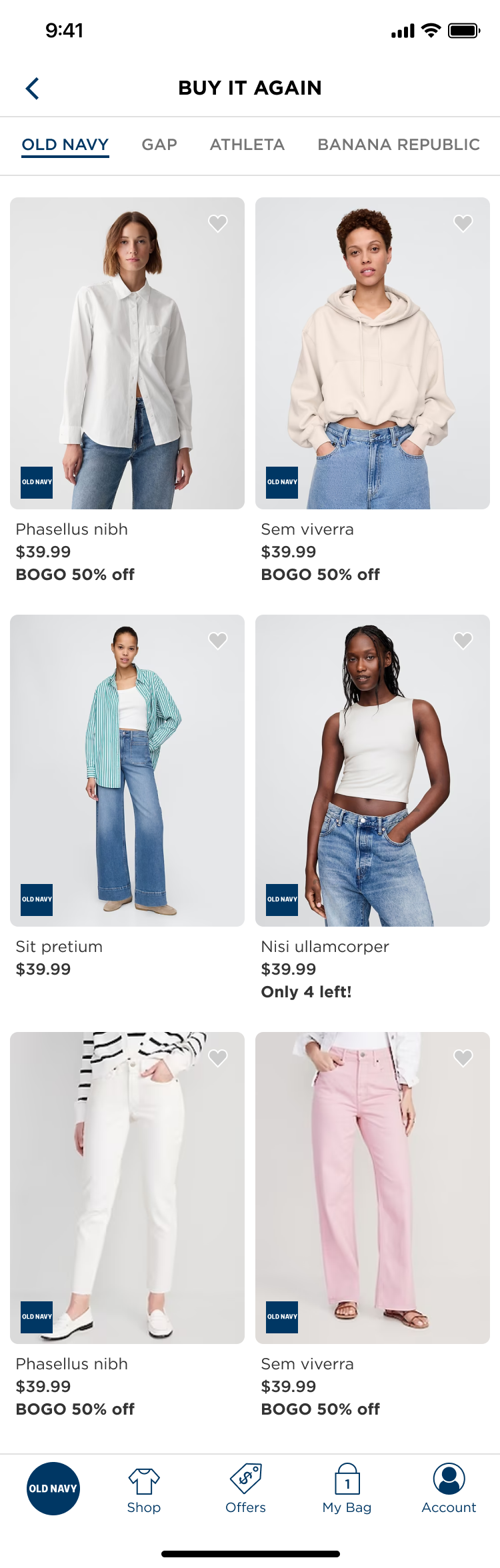
The legacy PLP was cluttered with redundant listings, showing the same product multiple times to account for different colors. This artificially inflated the scroll length and slowed down the user's ability to find unique styles.
Cross-Brand Display: MVP vs. V1
Mixing photography across brands sounds fine in theory. In practice, Old Navy's bright lifestyle shots next to Banana Republic's editorial imagery looks jarring. Brand stakeholders across Gap Inc. are also highly invested in how their products are presented, making this a point of real contention.
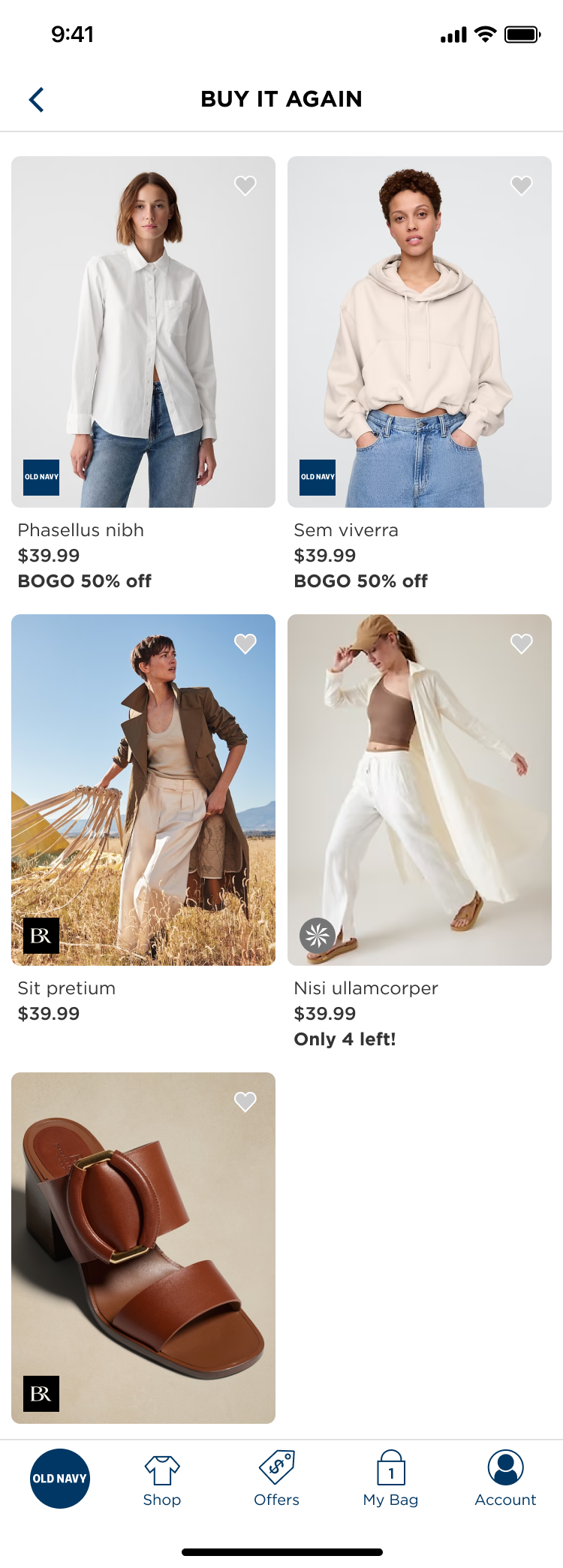
MVP
Mixed-brand grid to ship quickly and serve cross-brand shoppers.
V1
Brand tabs at the top, giving each brand visual separation and more control over presentation. Also useful for family shoppers whose histories span multiple brands.
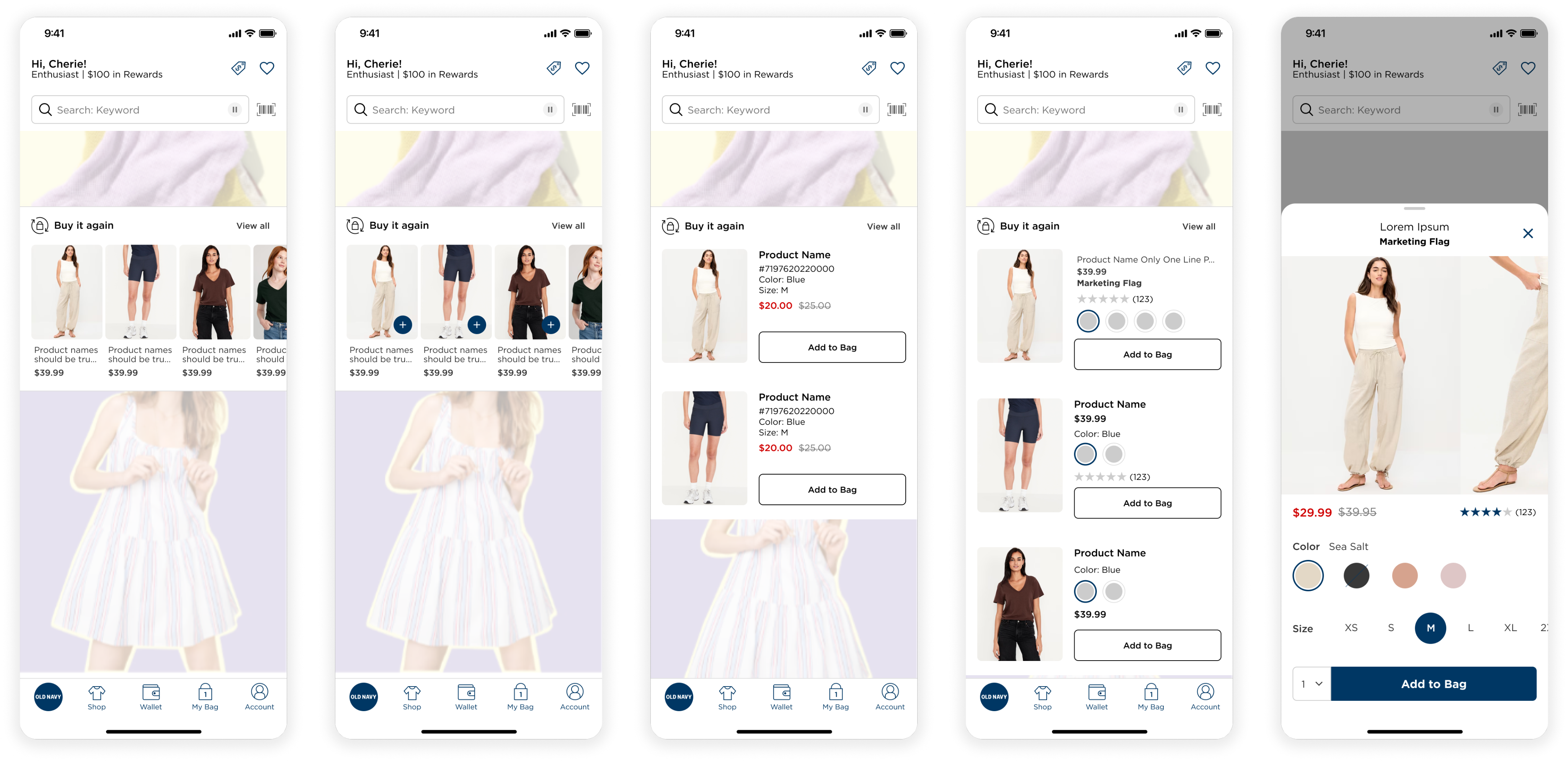
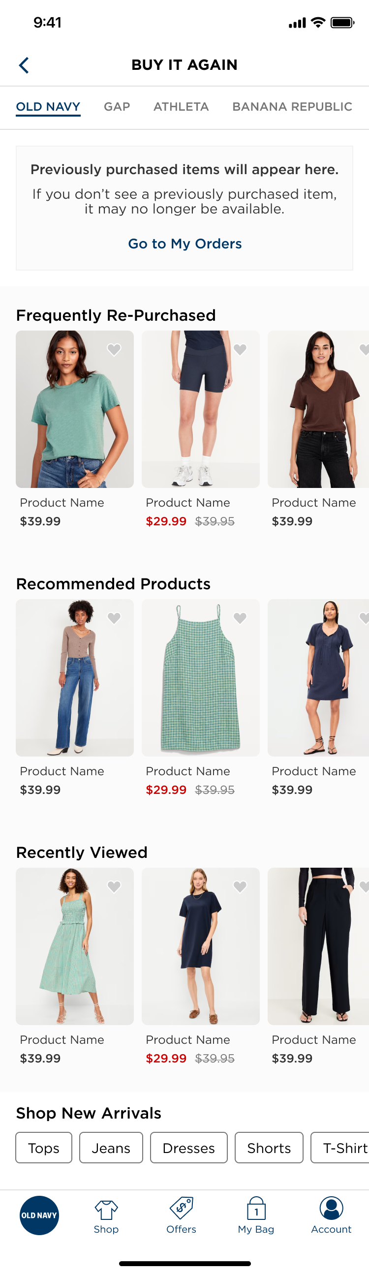
Empty States: Useful, Not Decorative
Given how short most users' lists will be, the empty and low-inventory states needed to pull their weight.
- No history: An informational tile plus three contextual carousels: Frequently Repurchased, Recommended Products, and Recently Viewed.
- With history: Recommended Products is removed to reduce density. The carousels stay at the bottom as supporting content.
Post-Action Logic and User Trust
A/B Testing: Data-Driven Refinement
To optimize the lukewarm results of V1, I led an A/B test to find the "sweet spot" between interactivity and scannability.
Next Steps & Strategic Roadmap
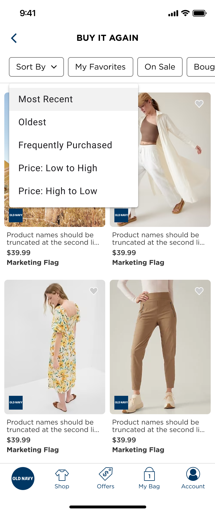
Sort Order Experimentation
Recency is the right default, but frequency or price-based sorting could surface different patterns, particularly for basics and accessories.
Extended History Window
The current 13-month cap limits depth. If the data infrastructure expands, the experience unlocks meaningfully for long-term customers.
Behavioral Triggers Over Always-On Placement
The most interesting open question isn't where to put the Buy It Again widget, it's when. With an average of 7 eligible items, a persistent homepage carousel risks going stale fast. Push notifications and emails tied to repurchase timing (given that most happen within 30 days) could drive more meaningful conversion than constant surface-level visibility. That's the next frontier worth exploring.


