Optimizing Product Discovery: The Color Swatch Evolution
Project Summary
At Gap Inc., users faced significant "browse friction" on the mobile app. To see color variations, users were forced to navigate back and forth between the Product Listing Page (PLP) and Product Detail Pages (PDP). This project aimed to streamline discovery by integrating color indicators directly into the PLP grid.
The Result: Through iterative design and A/B testing, we discovered that minimalist visual cues outperformed complex interactive components, leading to a significant lift in Add-to-Bag (ATB) rates and overall conversion.
The Result: Through iterative design and A/B testing, we discovered that minimalist visual cues outperformed complex interactive components, leading to a significant lift in Add-to-Bag (ATB) rates and overall conversion.
Role: Lead UX Designer | Impact: Increased Conversion & Reduced Bounce Rate


The Challenge
Efficiency vs. Redundancy
Efficiency vs. Redundancy
The legacy PLP was cluttered with redundant listings, showing the same product multiple times to account for different colors. This artificially inflated the scroll length and slowed down the user's ability to find unique styles.
Strategic Goals
- Reduce Redundancy: Consolidate color variants into a single product tile.
- Enhance Scannability: Provide "information scent" for color availability without adding UI bulk.
- Drive Conversion: Reduce "pogo-sticking" between the PLP and PDP.
Design Process & Strategic Pivot
The V1 "Accessibility vs. Density" Trade-off
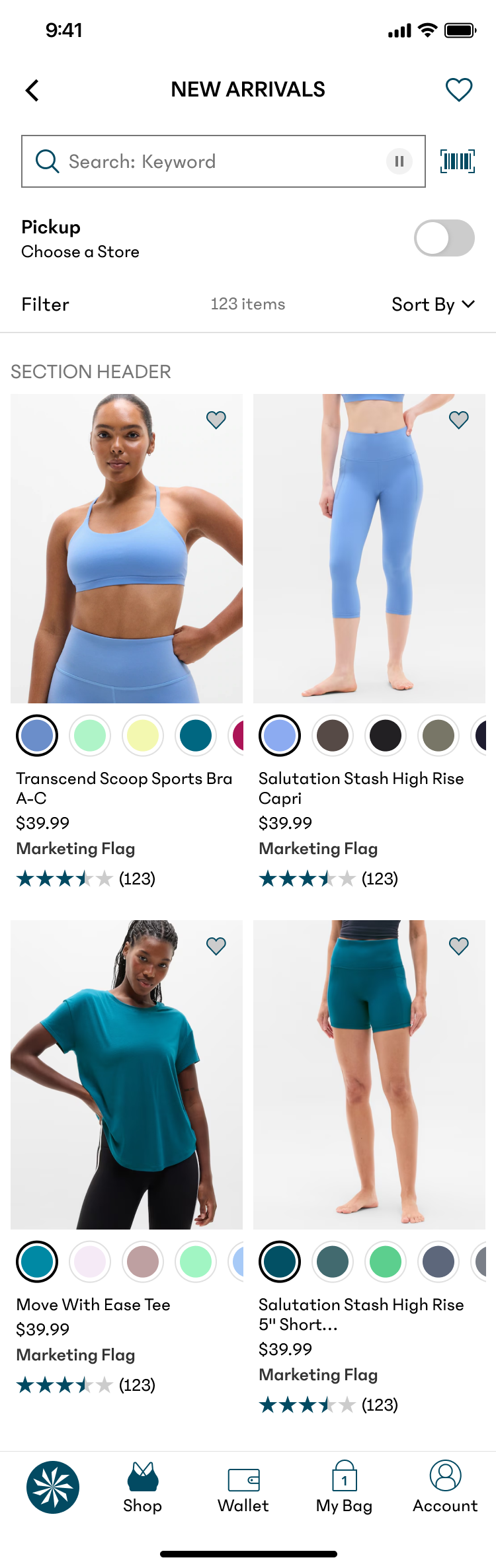
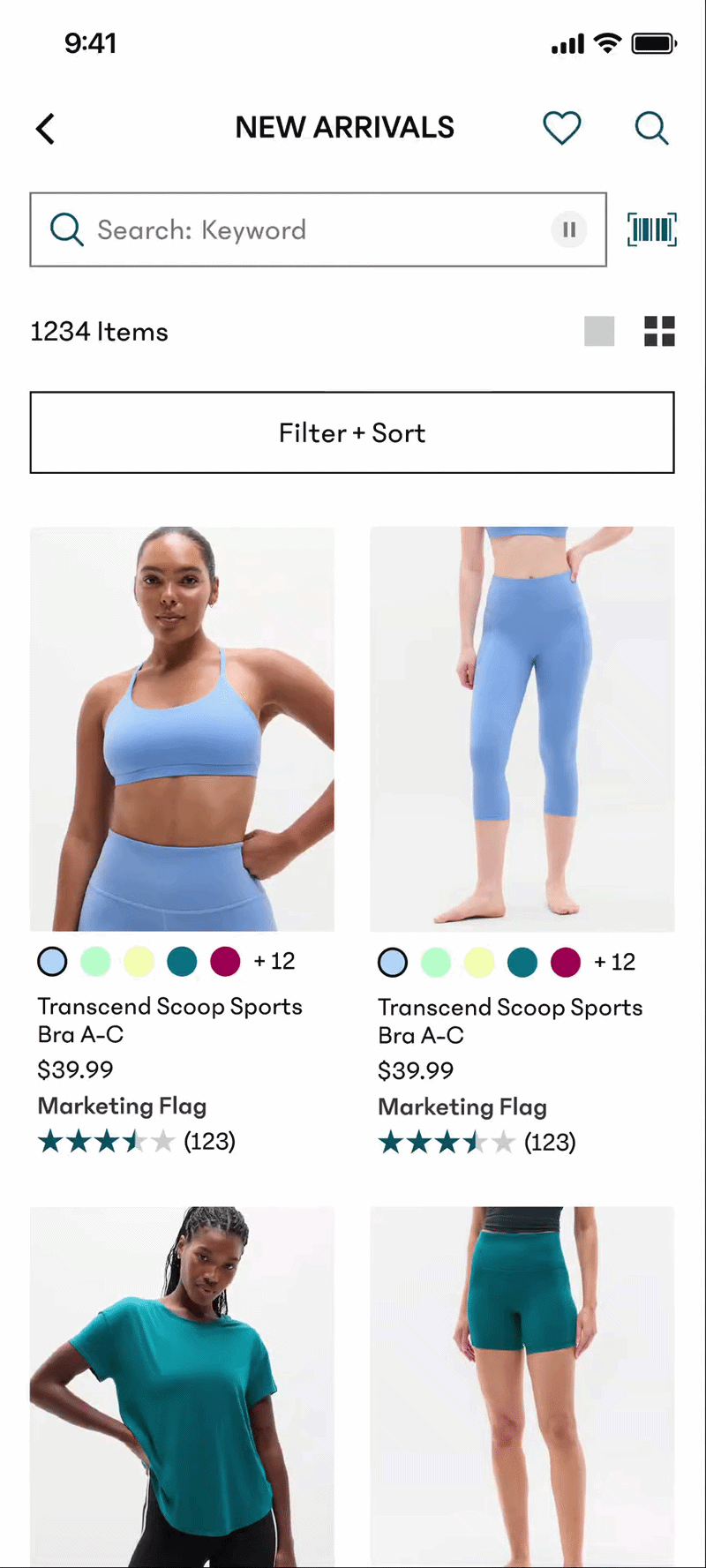
In our initial launch, we prioritized AAA accessibility standards by implementing large, swipeable tap targets for each color.
- The Conflict: While the large swatches were highly accessible, they consumed valuable vertical real estate.
- The Outcome: The increased tile height reduced the number of products visible per viewport by ~20%, creating a "heavier" browsing experience that neutralized the benefits of the new feature.
- The Takeaway: This phase taught us that accessibility must be balanced with information density. High-utility features can fail if they compromise the primary user goal: rapid discovery.
Post-Action Logic and User Trust
A/B Testing: Data-Driven Refinement
To optimize the lukewarm results of V1, I led an A/B test to find the "sweet spot" between interactivity and scannability.
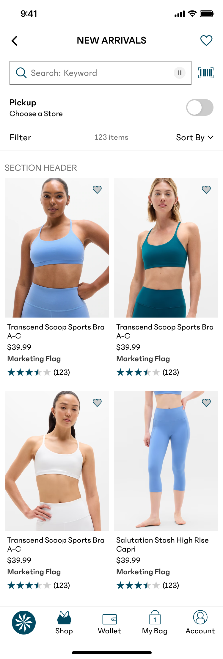
Control
- Design Strategy: No swatches
- Interaction model: N/A
- Results: Baseline
V1 (Live)
- Design Strategy: Large, swipeable swatches
- Interaction model: Interactive
- Results: Lower RPV
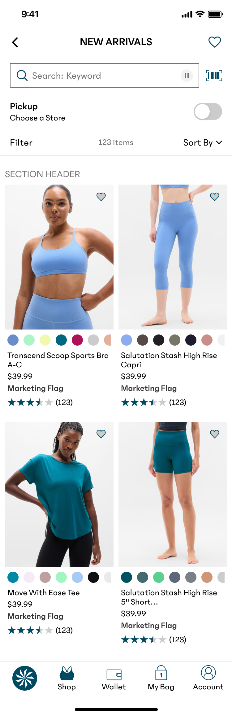
Design A
- Design Strategy: Small, scrollable swatches
- Interaction model: Interactive
- Results: Neutral
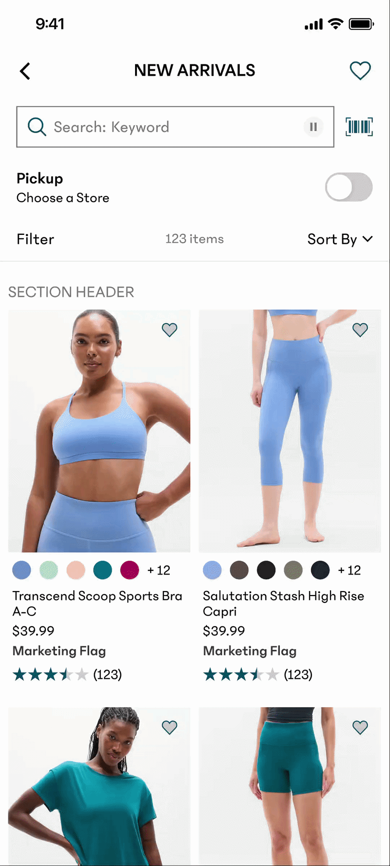
Design B
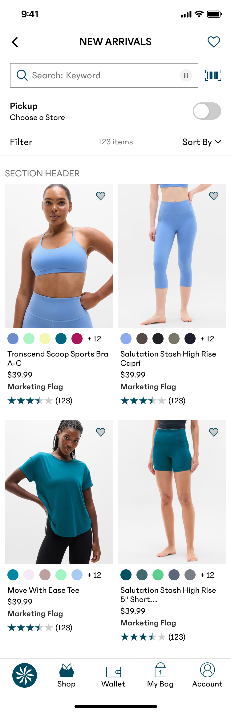
- Design Strategy: Small, truncated indicators
- Interaction model: Static/Visual Only
- Results: Winner - Highest ATB & Conversion
Why Design B Won
Design B provided the perfect "information scent." By using smaller, static indicators with a "+X more" truncation, we maintained a clean, high-density grid. Users didn't need to interact with the swatches on the PLP; they simply needed to know the options existed before committing to a click.
Next Steps & Strategic Roadmap
Moving forward, I would have liked to explore several high-impact opportunities to further optimize the shopping funnel
Responsive Viewport Controls
I want to experiment with a grid-density toggle that allows users to switch between view modes. In a tight, multi-column grid, the UI would prioritize maximum scannability with static indicators. However, in a "Single Width" or "Comfort" view, the expanded real estate would allow the interactive swatches to resurface without compromising the layout—giving users control over the information density.
The "Quick-View" Overlay
I would also be interested to test a Quick View sheet triggered by tapping a color swatch. This overlay would focus exclusively on high-fidelity product photos and available colors, allowing users to evaluate details and variations instantly. This provides a focused deep-dive without the disruptive context-switch of a full PDP transition.


